Reports
Last updated: February 27, 2026
Learn how to navigate and interpret the Reports dashboard in Spott to monitor key recruitment metrics.
You can quickly navigate to this page using G then R.
Learn more about all shortcuts here.
The Reports section in Spott provides an overview of your recruitment performance, allowing you to track key statistics for a selected period.
Reports give you both a high level summary and the ability to drill down into specific metrics, helping you better understand trends, performance, and outcomes.
Navigate this page
The Reports section is structured around the following areas:
Overview dashboard, where reports live and where you can create new ones
Report view, where you explore and customize individual reports
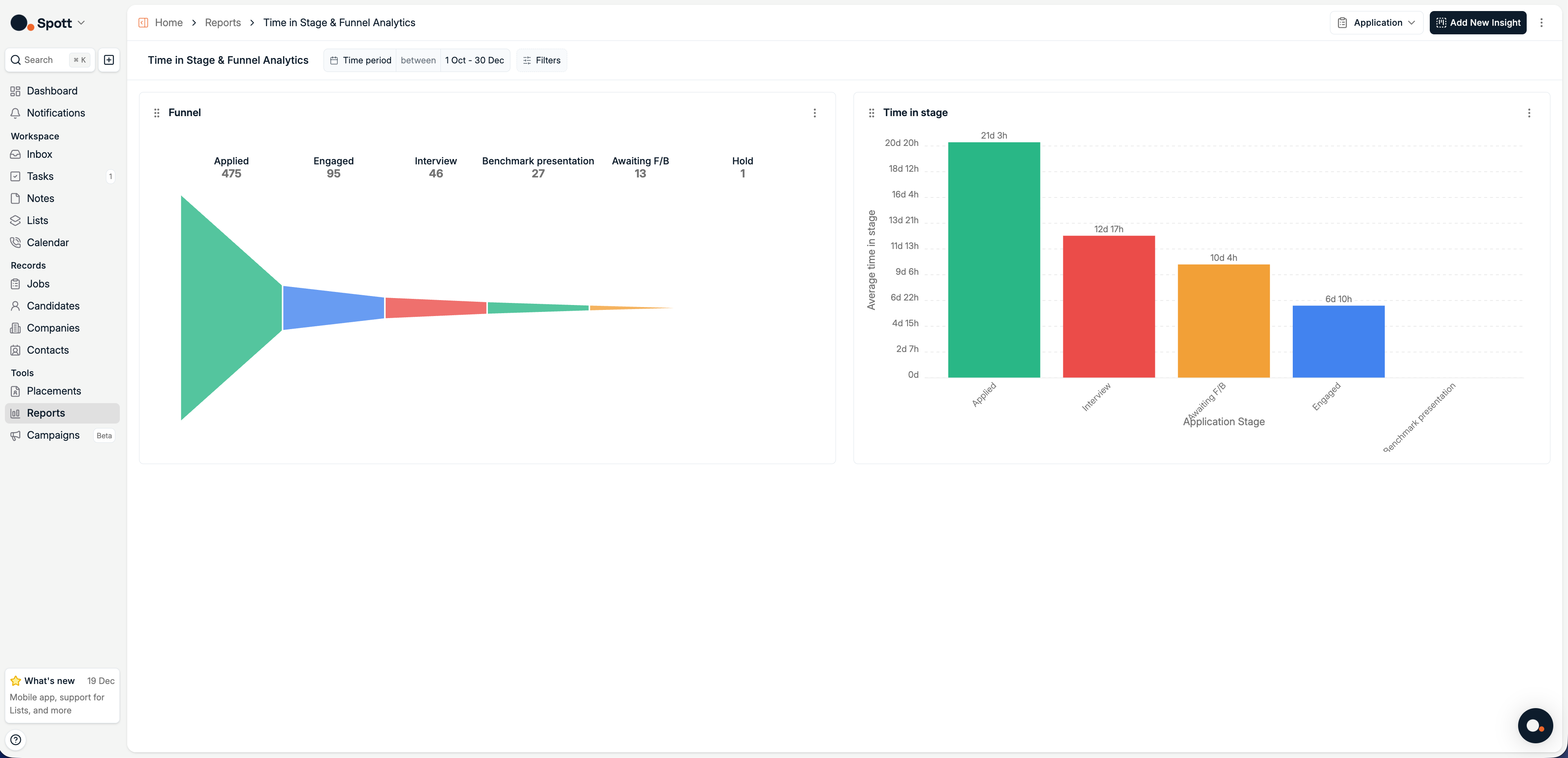
Funnel, to visualize how applications are distributed across pipeline stages
Time in stage, to analyze how long applications spend in each stage
Overview dashboard
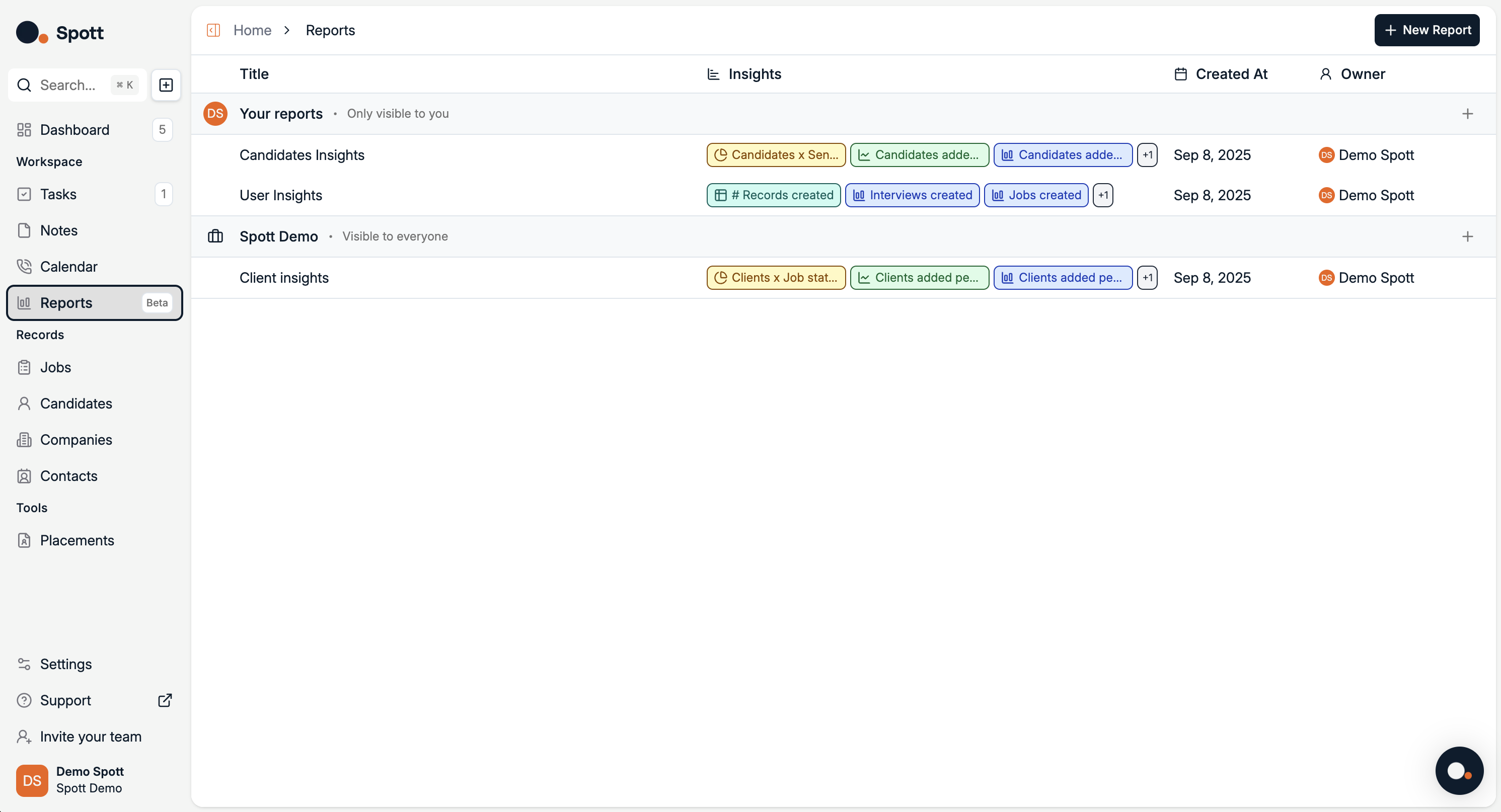
At the top of the page, you’ll find a New Report button, as well as reports that you have already created.
Report view
Access report view by clicking on a report or creating a new one. A report aggregates your data and displays it through visual dashboards.
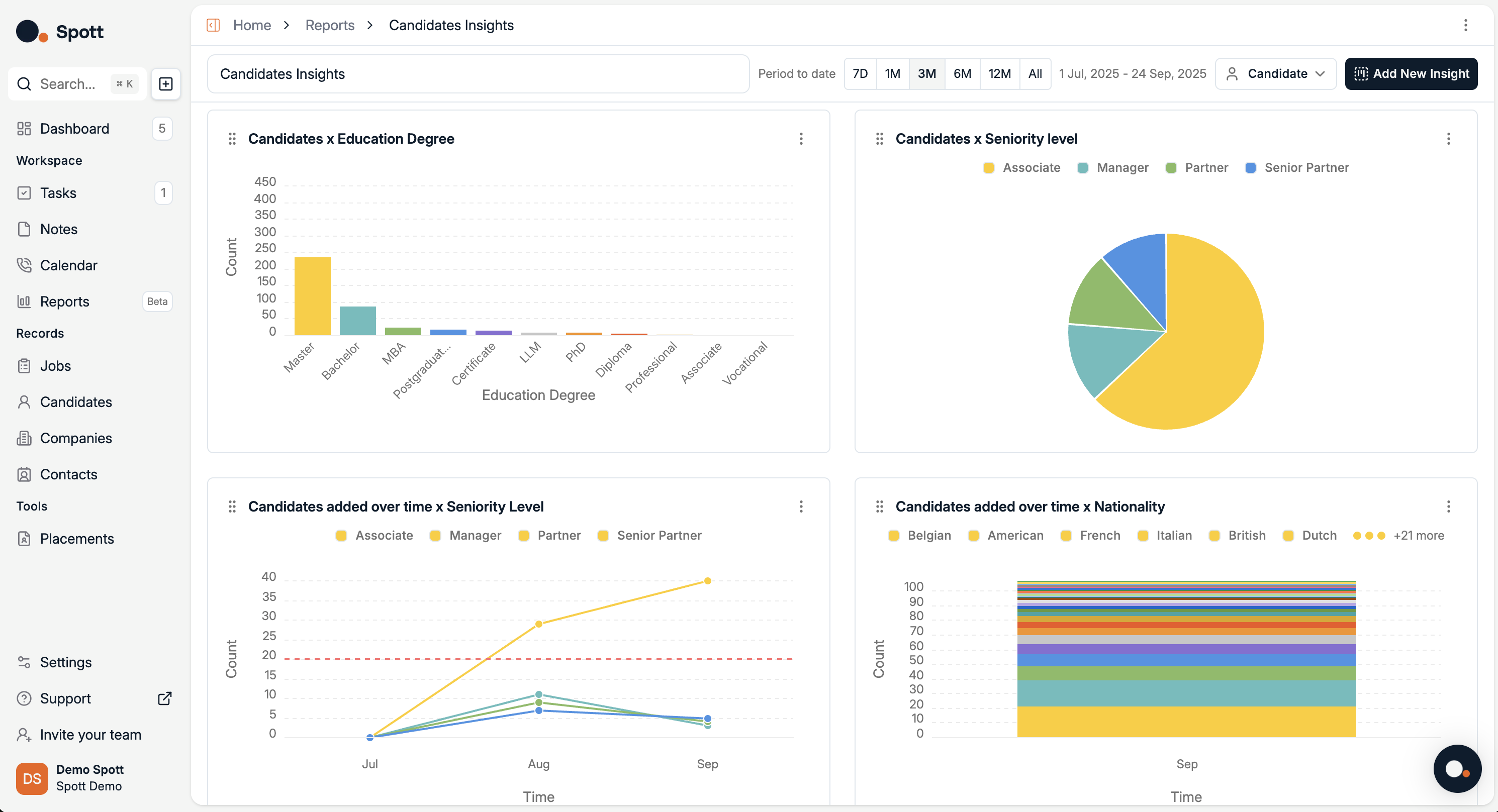
From this Report view, you can:
Change the reporting period by selecting
7D, 1M, 3M, 6M, 12M, All, or setting a custom date range.Switch record type by toggling between
Candidate,Application,Job,Company,Users,Applications,Notes,Placements,Rejections, orMulti-sourceif you want to report on multiple record types at the same time (here it’s set to Candidate).
Add a new insight by clicking Add New Insight to create additional visualizations with your own metrics and filters.
Filter and drill down using filters (for example candidate attributes, time, or job association) to refine the charts.
Customize chart type and grouping per insight, each insight can be displayed as different chart types and grouped by different fields.
Save or share reports for presentations and recurring reporting.
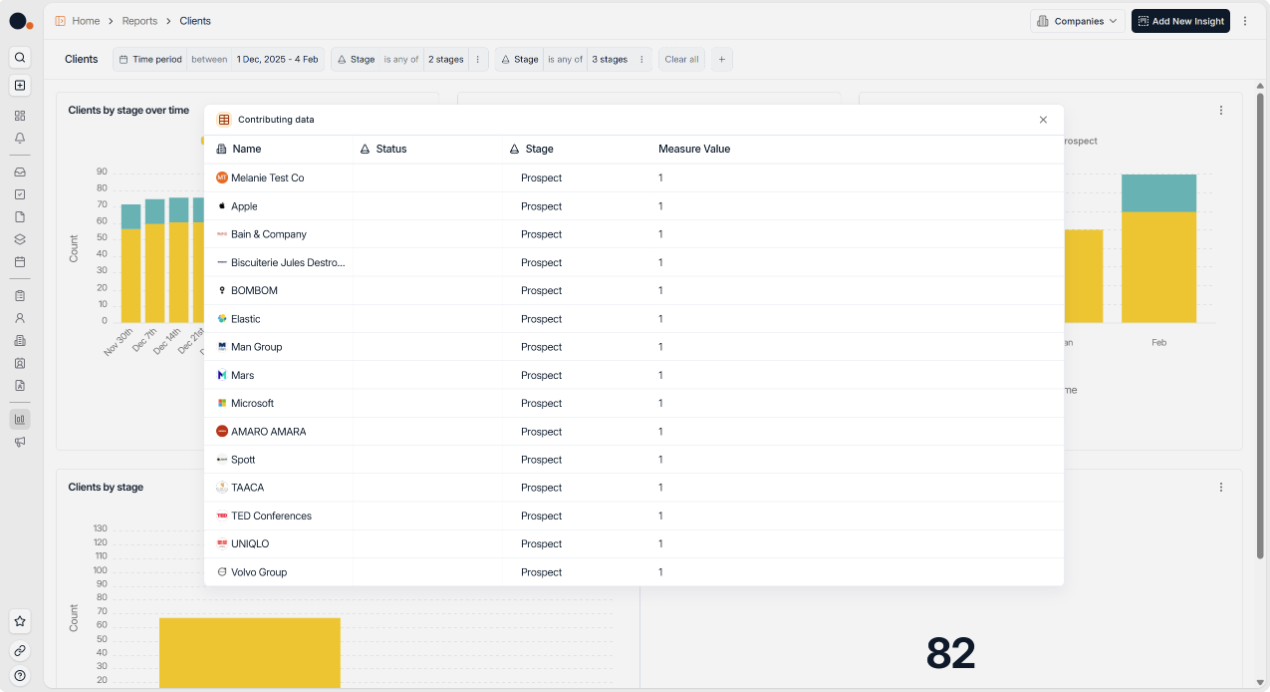
Drill down to the Numbers by clicking through on Reports to see the underlying contributing data. This makes it easier to understand exactly what’s driving your metrics.
Viewing and customizing graphs
When you edit or create an insight, a configuration panel opens where you can adjust how data is calculated and displayed.
You can:
View data in graphical form, with the default visualization depending on the insight type
Change the chart type using the chart selector
Adjust grouping, metrics, segmentation, and filters
Common chart types include:
Table, for raw rows and columns
Bar, for comparing quantities
Line, for trends over time
Pie, for proportions
Single metric, for a headline number
Switching between chart types can help you identify trends more clearly, for example using a bar chart to compare weekly totals or a funnel chart to visualize the recruitment pipeline.
Insight types and record types
The available insight types depend on the selected record type.
Available for all record types
When reporting on Candidates, Jobs, Companies, Contacts, or Users, you can create:
Historical values insights to track how metrics evolve over time
Pivot insights to break down metrics across multiple dimensions
These insight types focus on trends, volume, and distribution rather than pipeline flow.
Application specific insights
When the record type is set to Application, two additional insight types become available:
Funnel, to visualize how applications are distributed across recruitment stages
Time in Stage, to measure how long applications spend in each stage
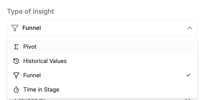
These insights rely on application stage data and are therefore not available for other record types.
If Funnel or Time in stage is not available, make sure the record type is set to Application.
Analytics data updates in real time based on your system’s activity, ensuring your reports always reflect the most recent changes.